This week I had my last day long workshop which was type and layout. The main aim of the day was to create a poster for an exhibition thinking about the layout and composition on the text and pictures which were required. We were not allowed to use the computer at all throughout the day and were instead using font sheets to create the text which we needed to add. I found the day really helpful as it stopped me from using the computer and made me think harder about where I was placing the text as each design took longer to form. The photos show my initial experimentation and then my final designs.
Friday, 7 December 2012
Wednesday, 5 December 2012
Graphic Images and Illustration
For the last project of the term, we were set the brief 'to develop a series of graphic images/illustration that clearly communicates to a specific audience a range of visual messages'. Upon reading this brief, and sitting in our weekly design lecture with my tutor outlining the afternoons workshop, I wanted to cry. Although I love graphic design, I HATE DRAWING (unless its on illustrator). In the afternoon we had a visualisation session where we were told to draw a certain thing including a bike, piranha, airplane, castle and some others each in 6 minutes. This was probably the worst 3 hours of my life!! I am so ashamed by my drawings I didn't even want to look at them again let alone stick them in my sketch book however in the end I managed to bring myself to do so.
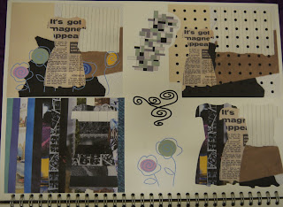
I chose to concentrate on clothes beginning with drawing them on illustrator (of course) and then moved on to using collage techniques within these drawings. At first I was not enjoying this project at all and had little motivation however after finding my feet, I was more inspired and ended up really enjoying experimenting and creating a set of graphic images as my final piece.
For the final graphic images, I built up a mixture of collages, patterns using illustrator and different drawings of clothes. I chose to use the idea of 'fashion through the decades' as I found the use of the changing colours palettes and styles useful to show continuity within the images but also change the design each time.
After a slow start with this project, I was really pleased with my final outcomes as I felt that I had really stepped out of my comfort zone exploring new techniques and managed achieve something I really liked as a piece of design.
Dream Catchers
A major part of my course is creating a source book of ideas and
inspirations from anything and anywhere. I have really enjoyed doing
this as it has shown me how I have become far more aware of other
peoples design since coming to uni. I read a lot of magazines and always
manage to analyse the typography in particular without realising as
well as the photos, colours, images etc which are included. When
searching for inspirations for a project or design on the internet, I
often look at other peoples blogs and tumblrs as these are always really
interesting and I enjoy looking at different peoples design. One thing
that I have noticed is the amount of people re-blogging dream catchers
in the form of tattoos, jewellery and images on clothing. I decided to
collect a few of these images and create my own design during an evening
when I had little else to do. I rarely get time to do any designing
that is not for a uni project with the washing, cooking and of course
going out that I do so I try to take every opportunity I can to fit it
in.
I am not an illustrator by any means but I was really pleased with the drawing I did. I think that it definitely reflects my style of very clean, crisp work which is enhanced by the use of fineliners. I am very happy with the outcome and over the Christmas holidays start in 2 days times (so excited) I want to build up some of my own work in between catching up with all my college friends and trying to earn some much needed money so I can buy yet more clothes.
Saturday, 1 December 2012
How to tie a windsor knot
For the past 6 weeks we have been taking part in one day projects
covering loads of different areas of design. This week I had an
information design workshop. The brief was 'From the lucky dip of
subjects, you are required to explain the process in visual terms only -
NO WORDS!' I was given 'How to tie a windsor knot'. This is something I
am not very familiar with as I have never worn a tie and therefore it
required a fair amount of research before I could start the project.
I experimented with different ways of drawing my subject and also used different mediums to find the style which I felt worked best.

I then created my final piece on illustrator adding a background and labels to show the order.
Thursday, 15 November 2012
Screen Printing
Today I had a screen printing workshop. It was held by Nick Saunders who is a graduate from NTU and now works as a freelance illustrator and screen printer. A few weeks ago we had him as a guest lecturer and it was so inspiring seeing all the work he has done since graduating from the same course which I am currently doing. He has worked for many different companies creating designs but the most impressive by far is working on the set of the Harry Potter film, 'The Half Blood Prince'.
In the workshop, we were making our screens as a practise and also to add to our portfolios of work. I chose to use a portrait of myself as this was easy to turn into a high contrast image which is necessary for a screen print. I had done screen printing previously at college however we did not make our own screen and were not shown how to do this. I found this process really interesting and it also means that the final outcome is more satisfying as you have worked harder for it. As it was only a practise, we did not change the colour of our ink however we did use different colour papers so we had a variety of images as the final outcome.
In the workshop, we were making our screens as a practise and also to add to our portfolios of work. I chose to use a portrait of myself as this was easy to turn into a high contrast image which is necessary for a screen print. I had done screen printing previously at college however we did not make our own screen and were not shown how to do this. I found this process really interesting and it also means that the final outcome is more satisfying as you have worked harder for it. As it was only a practise, we did not change the colour of our ink however we did use different colour papers so we had a variety of images as the final outcome.
Wednesday, 14 November 2012
Typography again!!
We spent another week on a typography project which is my favourite part of graphic design as it is so important in any part of a design. We were set a brief to create a 'logo' for ourselves using our names/initials in any medium we wanted to use. I did some initials sketches before adding colour and then creating them in illustrator which gave a precise and crisp finish to my designs.
I also began to use different processes to create a more creative finish but still using my original designs.
We had to chose 3 final designs which we felt were the best so I decided to use three which were very different to show the variety of work.
I also began to use different processes to create a more creative finish but still using my original designs.
We had to chose 3 final designs which we felt were the best so I decided to use three which were very different to show the variety of work.
Wednesday, 7 November 2012
'People are lonely because they build walls instead of bridges'
We were
set a brief to complete based on typographic composition. After choosing
a phrase from a list of potential choices, we had to represent this in
any way we liked considering formation of text. I chose to use 'People
are lonely because they build walls instead of bridges'. I was stuck for an idea and had a 'designers block' which, as this was a quick brief, was not very convenient. After staring out my window however, I got a wave of inspiration from my view. Despite it being an ugly brick wall on the side of a car park, it proved to help me with this project.
Once again I was indecisive on my final design as I like all the different photo effects for varying reasons.

Typography
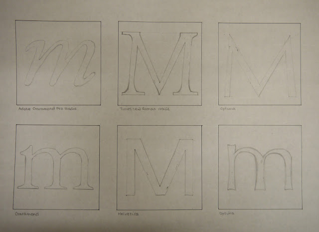
Our second project was
based on 'The Alphabet and Logotype Design'. I was given the letter 'm'
to investigate in detail using any method I chose. I looked my letter
in varying typefaces and used different mediums to experiment and create
potential outcomes.
I also looked at the anatomy of type and the different features that were present within the 'm' which varied depending on the style of font I was using.
Eventually, I came to a conclusion on a font of my own. I experimented further with this using colour and varying positioning of the lower case within the required 20cm x 20cm square.
Bonfire Night
On Monday
night, I went to the fireworks in Nottingham. Although they were not as
impressive as the displays which I usually go to at home, I enjoyed
being there with my new friends from uni. I took my camera and tested
the different settings however I am still not completely sure of how to
use it properly. Some of my photos came out well but many weren't so
good. With many of the photos, I had to edit the brightness and contrast.
Subscribe to:
Comments (Atom)


