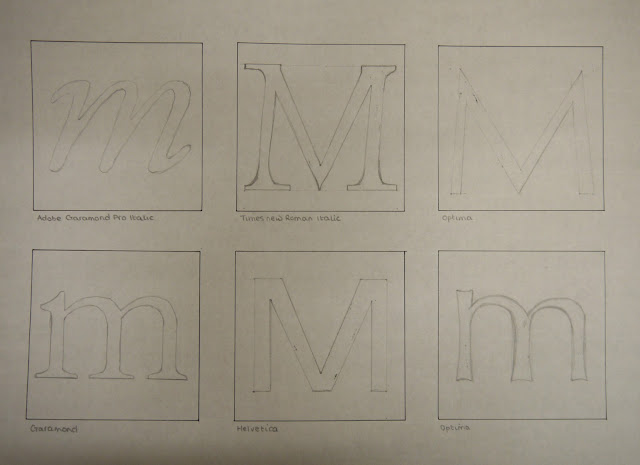
Our second project was
based on 'The Alphabet and Logotype Design'. I was given the letter 'm'
to investigate in detail using any method I chose. I looked my letter
in varying typefaces and used different mediums to experiment and create
potential outcomes.
I also looked at the anatomy of type and the different features that were present within the 'm' which varied depending on the style of font I was using.
Eventually, I came to a conclusion on a font of my own. I experimented further with this using colour and varying positioning of the lower case within the required 20cm x 20cm square.


No comments:
Post a Comment